| I started with thinking of a design to make. I wanted to make sure it was black and gold though. So I decided to make it a square with 4 separated squares. I put the yellow color first and then the black. I think the to two colors went together really well. I really like how it turned out! | 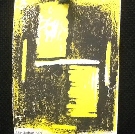
Well I wanted to make sure it was different from others so I made this design. I related it to my school colors, black and gold.
It's not as easy as you think. You have to follow each step to the letter.
It is a really fun project and I would do it again.
The mess it makes. You have to get a lot of stuff to make your print but in the end it's worth it. |
3 Comments
I'm most proud of how my final project turned out. I think when added the filters it made the pictures look really good. I love how my quotes went really well at what my pictures where describing. In the photo with the quote by Greg Werner I think that photo turned out great because it shows the ball moving too. I would like to improve on the elements I was in. It kind of looked weird because I was in the snow but I think it still turned out good.
| 1. Do I like art?
Yes I like art. A lot of the stuff we make is pretty cool. It draws me in once we start projects. 
2. What do i think of art?
Art is very important. I think it is very important. Art can bring the artistic side of you out. 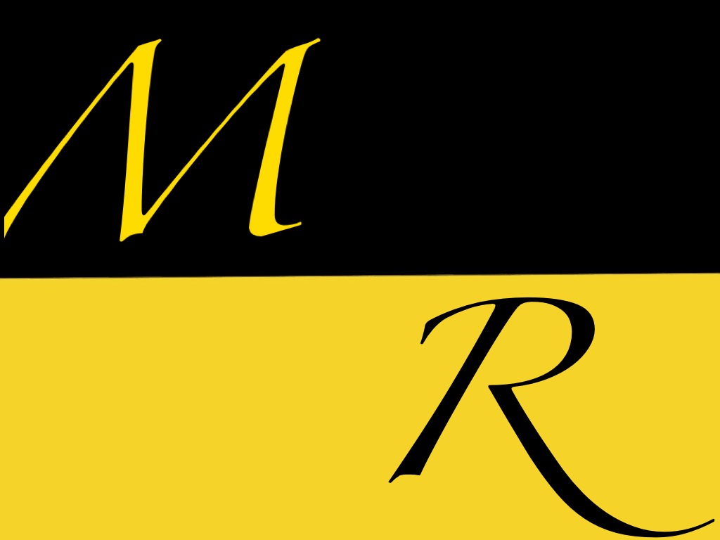
3. What medium is my favorite?
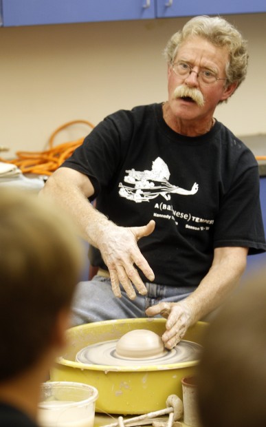
Clay is my favorite. You can make almost anything with clay. It can be shaped in many ways. The way it looks after is done is always great to see! 
4. What do I want to improve on in art?
I want to improve on my drawing skills. I really don't have any. I would like to someday be able to draw a perfect picture. 
5. If I could have any job in the world what would I be?
I want to be an Engineer. I think it would be cool to be able to design things that would help others. 
Categories
|